IP Mapping

Copyright 2001 Stephen Coast - steve at fractalus dot com
This site is kindly hosted by Damien M. Jones on fractalus.com

Intro

This work follows on suggestions made by Bill Cheswick, Bell Labs and Hal Burch, CMU in a paper about mapping and visualising the internet. Everything here is indepentant though, own tools, own data etc. A paper might come.

How its done

to the layman: When you send or receive data over the internet you computer doesn't really give a damn how the data travels. The media (wire, optic fibre, ox cart) and route (via hong kong or Champaign-Urbana) are irrelevant so long as we don't mind waiting. Of course, we do mind so in general routers try to route packets over the fastest link and shortest distance. You have to perform some tricks to actually find out where data is flowing. A program called traceroute does this by sending out suicidal packets of information that self-destruct after they have seen a set number of computers. Since a piece of data might say hello to 20-30 computers on its journey, by default traceroute sends out 30 packets (actually some more, just in case some get lost and so on) with suicide settings of 1,2,3 ... 28,29,30. When a packet kills itself the computer that it dies in sends a little RIP note back saying "uh-oh, he died". Thus the computer is telling us who it is. Of course some computers don't care if the packet dies, some respond with nonsense, some respond too quickly or too slowly... So we take all our results with a pinch of salt, but in general we have a route between two computers networks and the time it took at each hop. We can then analyse this mess of links, and produce pretty graphs. That gets in to more complicated stuff.

to the geek: Parse traceroutes from us and public traceroute servers to random ips and dump individual hops in a database (MySQL) with Java and JDBC. Give each node a point in space and attach it with springs to its linked nodes. Give them all a repulsive electric charge, set simulation in motion. Dump data into a table, then output some povray files and render. Also do some pretty stats and 2-d layout with mathematica.

Note

Take everything here with a pinch of salt. "distance" means time in milliseconds, equated as distance. The various graphs and rendered images come from the same dataset but at different stages of placement of points in space, developmnet of algorithms etc. There might be bugs. Due to the nature of the internet, timeings and host names can have no relationship with distance and country of residence etc. This is in effect a test run to make sure stuff works, before I pour 100,000 IPs in, instead of 10,000. There are lots of interesing off-shoots to this stuff. There are more bits that will come when they are ready.

Stats

The run here has 10334 edges, 8996 nodes.

Histogram of time (ms) between hosts
BarChart of frequency of number of edges per node

Average difference in mapped and actual distance between hosts against iteration of spring placement algorithm

Average distance between host and center of sphere against iteration of spring placement algorithm

Number of hosts reachable after n hops from my machine


3-D renders (without electro charge)

(Basically useless, but look neat)
layered by depth from my machine. Elipsoid type shape expected. Radius of sphere proportional to number of edges it has.


These mpegs won't play on windows media player. I couldn't get mpeg_encode to output legal mpegs (you'd think thats the whole point...). xanim/smpeg etc will play them though.
1.mpg First movie. 20 meg, flying outside.
through.mpg Fly through it, 13 meg.
con.mpg Fly round image 8, 27 meg.


3-D renders (with electro repulsion)

Phone home (asking public tracerout servers to trace to me) data plotted Much more interesting. Clusters visible etc. VRML screeny
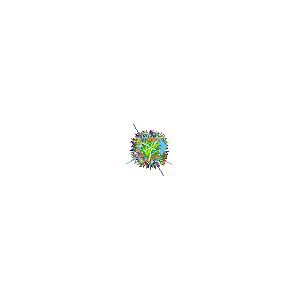
Greetings from the genetics department! A routers eye view


VRML

My hate-hate relationship with VRML resulted in some models. The full dataset is way too big, so we have UCL's network in this model. The hostname will apear if you hover over a node. More specifically, this is every host that is on UCLs DNS that responded. There are 21067 hosts on the DNS list, 4672 responded (excluding computer science, who have their own stuff (and probably other sections such as the student network etc)). This is a bit big still for vrml i.e. it will crash. Instead, we have some cut down versions:
150 odd hosts - fine, clusters etc
600 odd hosts - great! (500k)
1600 odd hosts - Will be damn slow (1.2 meg).


2-D renders


Without electro, and crosslinks. Not nice. The whole of UCL, in 2d. Distance represents time in ms, but the image is scaled. Click to see an animation of the layout process (620k gif) Lots of interesting things to see in the process ;-)
(putting all the nodes on a plane)
The UCL image is nice. Each cluster is a building/department. Those of all the same colour represents a department with their own hub(s) etc, those with many colours are smaller departments that come off the same network hardware. The longer links are inter-department etc. The animation is from one of my first algorithms - it lays nodes out all at once and randomly (spot the mistake(s)).

Just the map
layout animation, 4 meg
sprinkle some hostnames... and some numbers(?)


Map of the net, 32,000 nodes. The dense areas are the US upper left, uk lower middle. Countries dotted around. The orange branch top-right is germany etc. Different from cheswick etc, clumpy. Layout algo is much faster now [a few hours], lays out nodes by depth etc. The mass of green are .net hosts

Colours used

The table below was used for some of the early plots. Most now use a random (seeded) colour for each domain. TLD's are used on the net, .chem.ucl.ac.uk, .phys.ucl.ac.uk etc are used inside UCL. Grey is also used when no domain is found. This will be changed so that no-domain becomes nearst known nodes colour


New stuff

These maps are kind of nice for topology but how are the computer really distributed? (He was thinking at 4 am). Well quite a fe are layed out in a line with coax ethernet cable or have CAT5 cable but the computers are layed out in a line next to each other. Of course this is not always the case but its not very realistic to have them in "stars" or "koosh balls" like above. So I remapped the UCL hop data so that a koosh ball is set out with the links joined together in a line with the so that if a is a central node and b(5ms away from a) and c(6ms away from a) are connected to it at then a is connected to b (5ms from a) and b to c(1ms from b). I only do this to one "level" of koosh balls. If you applied this a couple of times you would only have a big long line.
The layout algorithm is the same as above. So anyway we now have the toopological view and an extreme view of how the machines may be actually distributed. Sort of. Click the still below to get a nice mpeg. Its very nice but only smpeg will play it, but thats fine if you are running a stable operating system.


Software used

It wouldn't have been possible without...


PVMPOV berkeley mpeg tools

ULO Special thanks to the ULO & Chris Clark for lending me computer time.

Hardware used (renderfarm)

1 * Dual P3-1Ghz, 1 * P3-860, 1 * P2-300, 11 * P3-450, 2 * P3-700, 3 * P3-630, 2 * P2-400, 1 P1-200, 1 * P2-350, 3 * P3-630.